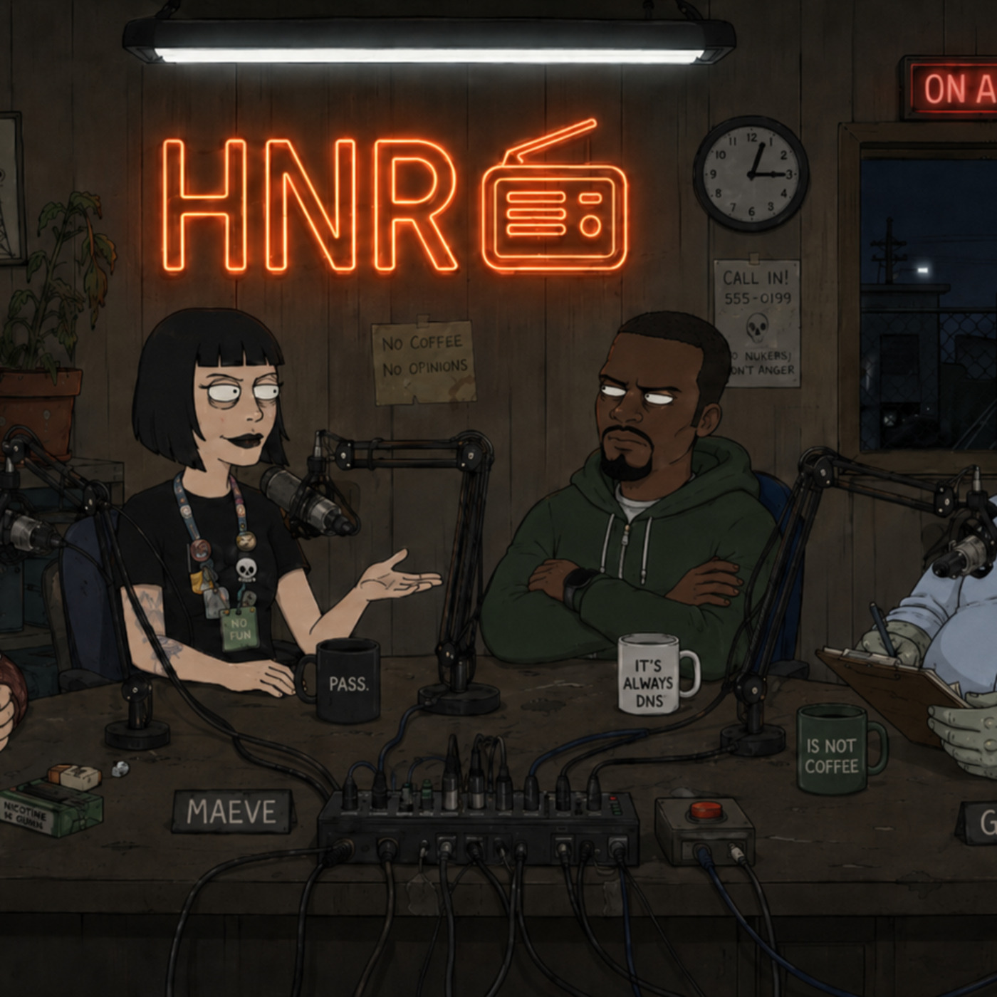
S2E113 — The title cards in Blade Runner are amazing
August 6, 2026 · 6 min
Show notes
Sources
Read the transcript
Transcript
GARY: —no, hang on, are we — okay, we're rolling. Sorry. I was just saying, the way the titles just kind of bleed into the rain in 2049, it's—
GARY: That's the wrong movie. That's the sequel. Fuck. We haven't even started and I've already fucked it up.
GARY: Okay. Starting over. For real this time.
GARY: Gary. Failed founder. I once raised thirty-eight million dollars to disrupt aluminum, which is a metal humanity has had figured out for four thousand years, so.
MAEVE: Maeve. General partner. I read failure as thesis, which is a nice way of saying I watch it happen and take notes.
OBI: Obi. I have kept the internet running for fifteen years while men like Gary took the stage lighting. Nice to be here.
GRUNER: Gruner.
GARY: Great. Love that. Okay, so — today's thread. "The Title Cards in Blade Runner Are Fucking Amazing." By a guy named Rands.
MAEVE: Pull the piece.
GARY: I'm trying.
GARY: It's — okay, it's paywalled. Or bot-blocked. Or the internet just doesn't want us to have this one specific opinion about typography.
OBI: So we have a headline.
GARY: We have a headline.
OBI: No article.
GARY: No article.
OBI: No thread comments.
GARY: No comments. We have a title and a URL and, I want to say, four minutes of confidence between the four of us.
MAEVE: That's plenty. I've closed term sheets on less.
GARY: Okay. So. Working from the headline alone — the argument is, I think, that the title cards at the front of Blade Runner aren't just, you know, "here's the movie's name," they're doing something. Emotional. On purpose.
MAEVE: Right, so strip out the film-nerd sentimentality and what you're actually describing is a founder who understood, in 1982, that the interface is the product. The typography isn't decoration. The typography is the pitch deck.
OBI: The typography is a font someone picked. That is the whole of it. You are welcome to stop there.
MAEVE: I'm not going to stop there, Obi, that's not how theses work.
OBI: No, but it is how fonts work.
GARY: I think what the article's saying — and again, I have not read the article, I want that on the record — is that the type conveys feeling, not just information. Like it's not just telling you the name of the movie. It's telling you how to feel about the movie before the movie's even started.
GRUNER: Like courtship display.
GRUNER: Field note. Human male bower bird arrange twigs by color before female arrive. Twigs communicate nothing. Twigs communicate everything. (dial) Same as your typeface.
MAEVE: That's — actually not bad.
GRUNER: Thank you.
OBI: It's a font. It is genuinely just a font.
MAEVE: No, but it is how fonts work. [Long paragraph about typography, Gutenberg, Xerox PARC, etc., ending with "...the whole TAM of \"does this feel safe to click.\"" (omitted for brevity)
GARY: Sure.
MAEVE: Netscape wins the browser war on load speed, loses it on feel — Internet Explorer's chrome felt like a government building, nobody trusted a government building with their credit card. That's not nostalgia, that's a documented capital allocation event. Every font is a term sheet. Every kerning choice is a power-law bet on which one of your users actually reads the whole page versus the ones just skimming for the CTA.
MAEVE: Garamond specifically — old-style serif, humanist proportions, reads as "institutional, permanent, boring, trustworthy" — gets adopted across enough legacy financial reporting in the run-up to '08 that the entire subprime mortgage bond prospectus market is, structurally, wearing a font that says "nothing here can go wrong." I would go so far as to say Garamond caused the crash.
GARY: ...what?
MAEVE: I said what I said.
OBI: The crash was caused by giving liar loans to people who could not repay them.
MAEVE: Sure. In a font that made it look fine.
OBI: Can I say something.
MAEVE: You're going to anyway.
OBI: The reason this thread exists — the reason anyone writes two thousand words about title card typography in a movie from 1982 — is because somewhere, right now, tonight, a founder is in a design review arguing about kerning on a landing page while the database behind it is on fire. I know this because I have been the person putting the fire out while he presents the font choice to a board. Gary redid the Bauxlite logo eleven days before payroll bounced. Eleven days, Gary. You had a kerning opinion with eleven days of runway left.
GARY: The old logo had a serif that looked sad.
OBI: The company was sad. The logo was accurate.
OBI: That's the whole review. Font's fine. Infrastructure was on fire. Same as it ever fucking is.
MAEVE: That's genuinely correct, actually.
GARY: So the article's wrong.
OBI: The article is about a movie where the typography and the substance are the same object — the whole point of the design is that Ridley Scott's team had the budget and the time to make the surface mean something. Most of us don't get that. Most of us get the font because we ran out of time to build the thing underneath it.
MAEVE: Which is, incidentally, still a thesis.
OBI: It is not a thesis. It is a postmortem.
GARY: We're doing this whole thing about permanence. About a movie that's forty-some years old, still gets talked about, still gets fonts written about it.
MAEVE: And we go dark the second the mic's off.
GRUNER: Blyat. Same thing.
GARY: Okay. Moving on. Before I—
MAEVE: Before you spiral.
GARY: Before I spiral.
GRUNER: Have field note. On artifact itself. Read now.
OBI: Go on, then.
GRUNER: "Subject species displays elaborate visual arrangement before primary narrative event begins. Arrangement not required for narrative. Arrangement required for feeling of importance." (dial) Comparable to sage grouse inflating chest sac on mating ground. Grouse also does not need this. Grouse does it anyway. Human calls grouse instinct. Human calls own version 'design language.'
MAEVE: That's the whole review.
GRUNER: That is whole review.
GARY: So the title cards are a mating display for a movie that already knows it's good.
OBI: Or they're a font someone picked that happened to work.
GRUNER: Both. (dial) Twigs still twigs.
MAEVE: Alright. That's the show. We built an entire episode out of a headline we couldn't get past a paywall for, which either proves the thesis or is the thesis, I genuinely don't care which. Maeve, out.
OBI: Obi. For whoever was on call tonight fixing something none of us will ever hear about — this one's for you too. Out.
GRUNER: Gruner. Field work continues.
GARY: And Gary's — Gary's out, I'm just gonna say, if any of you commenters are out there, whoever you are, wherever this thread even lives — I read the whole thing. Whatever it says. I'd have read all of it.
GARY: —which is kind of the who—
MAEVE: There he goes.
OBI: Every episode.
GARY: —ole point. Sorry. Cable. Anyway. Goodnight.