S1E71 — The AI Aesthetic
July 31, 2026 · 6 min
Show notes
Sources
Read the transcript
Transcript
GARY: —no, because it's not ONE logo, it's a pattern, they're all— okay, fuck, is this on? It's on. The logos are dicks. I'm saying it. Tonight's thread is about the dick-shaped—
MAEVE: "Curiously anatomical."
GARY: What?
MAEVE: The comment says "curiously anatomical." You said dicks. On air. Before your own name.
GARY: Anon373839 said it better than me, fine. Everyone says everything better than me. That's going to be a theme tonight.
OBI: Eleven seconds on the air and you have already lost to the comments. Even for you, this is goddamn speed.
GRUNER: Logo is dick.
GARY: Thank you, Gruner.
GRUNER: No. Is from notes.
GARY: Why is it doing that. It hasn't done that in years.
OBI: It senses bullshit. It is old equipment from a bullshit‑rich environment.
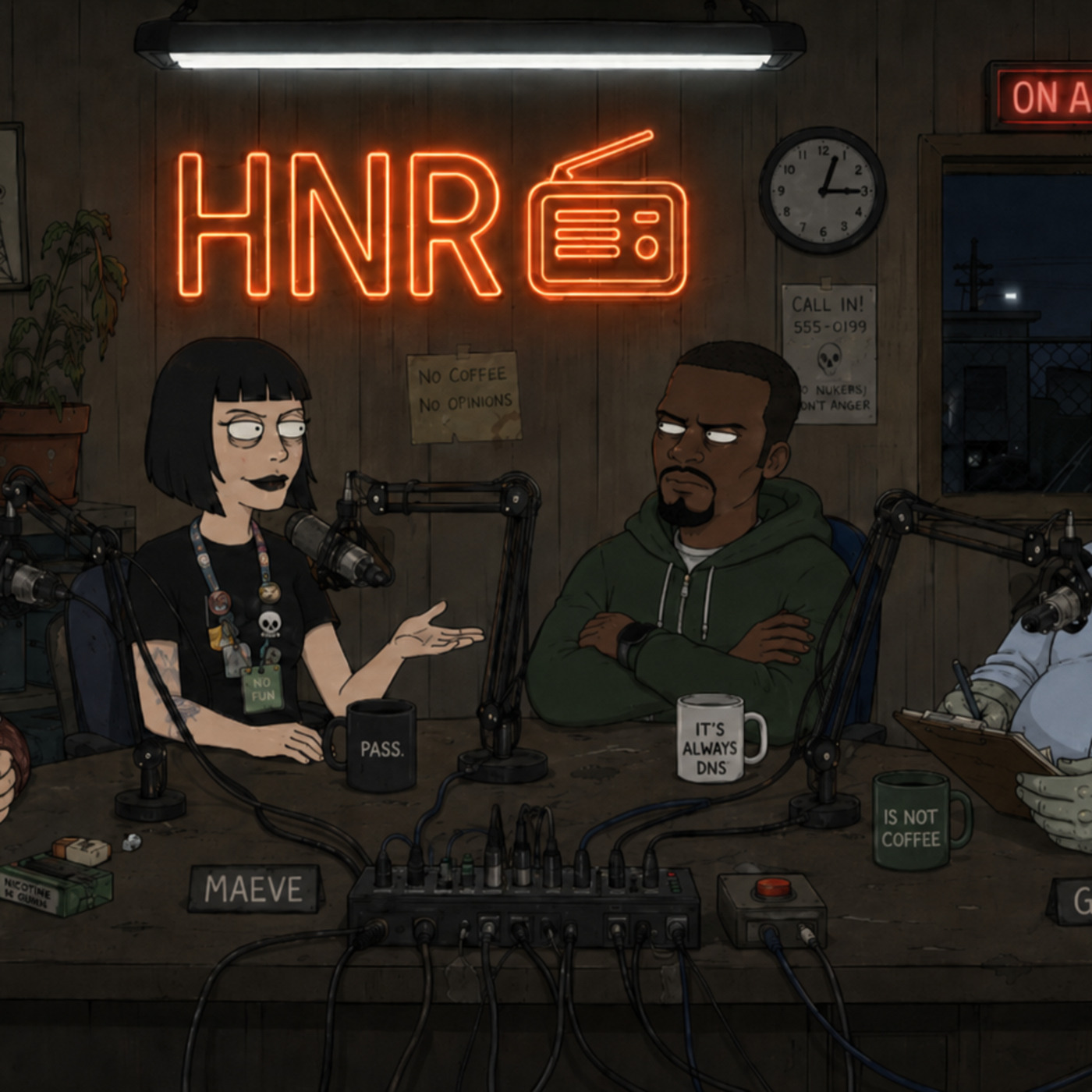
GARY: I'm Gary.
MAEVE: Maeve.
OBI: Obi.
GRUNER: Gruner.
GARY: Tonight's thread: "The AI Aesthetic." Somebody wrote an article about how everything looks like AI now, and Hacker News showed up sixty‑four comments deep to perform the autopsy.
MAEVE: The article is a loss leader for the comments. The comments are the product. Only functioning business model left on the internet and nobody even raised a round for it.
GARY: I read all of them. Even the greyed‑out ones at the bottom.
OBI: Of course you did.
GARY: Top of the thread. Anon373839, and I quote: "How could an article on the AI aesthetic not mention the curiously anatomical company logos?" That comment has more karma than anything I have ever shipped.
OBI: Founders drawing dicks again? Fucking shocker.
GARY: Or — hear me out — it's biomimicry. Organic forms for organic intelligence. Nature is the oldest design system there—
OBI: It is insecurity, you aluminum fuck. A man who cannot ship a product draws a kidney and calls it a brand.
MAEVE: Anatomical logos are failed Series B energy. The mark of a company whose moat is a vibe.
GARY: Same commenter, and this is the part that actually matters: "tiny icon trend." "Icons next to menu text are pretty ornamental." The icon isn't doing anything. It's jewelry.
MAEVE: Everything is ornamental now. The interface is a lobby. It exists to make you feel the company has a design language, while the product behind it is a text box and a prayer.
GRUNER: Field note. Human sees small icon, feels nothing. This is called "brand."
OBI: Some intern drew those icons at a hundred percent on a retina display and nobody ever checked them at actual size. That is the whole aesthetic. Negligence with a mood board.
GARY: You say that like you watched it happen.
OBI: I have watched it happen four times. Twice at companies you have heard of.
GARY: ...Moving on.
MAEVE: Piskov. Entire comment, verbatim: "Stroke thickness — it should be the same as the letters." Shortest comment in the thread. Also the best one.
MAEVE: He's right. That is the fix.
GARY: Anon373839 again ties it to the — quote — "anorexic typography trend from" — tilde — "2013." The hairline fonts. The grey‑on‑grey. We all did it. I did it. I PAID people to do it.
OBI: You did every trend this thread is mourning. Your career is a museum of dead aesthetics with a gift shop.
MAEVE: This isn't typography, it's infrastructure neglect. Strokes thinner than the letters are icons nobody intends to maintain. It's running Kubernetes on fucking Raspberry Pis.
GRUNER: Blyat. My icons also wispy. I feel attacked.
MAEVE: Thin strokes are what a civilization draws when it has lost the ability to commit. It's the printing press in reverse. Gutenberg made letters heavier so they'd survive the press; we make them lighter so they can be deprecated without anyone filing a ticket. Every era gets the typography it deserves, and ours is pre‑apologetic.
GARY: ...what?
MAEVE: I don't repeat myself. Scroll.
GRUNER: Stroke thickness is new burn rate.
GRUNER: I write this down.
GARY: Counterargument. Waterluvian: web and Electron apps, quote, "get zoom for free," and the icons, quote, "work better for my brain." Which is a defense. An actual good‑faith defense, sitting right there in the middle of the dogpile.
GARY: And honestly? He's just telling you what works inside his own head. That might be the most honest comment in the whole thread.
GARY: They just... get zoom for free. Fuck. I spent six months begging Bauxlite's frontend team for a zoom that didn't shatter the layout, and this guy gets it from the browser. For free. From the BROWSER, Obi.
GARY: —AND CONTRIBUTES NOTHING — sorry — contributes nothing. Cable.
OBI: Nobody is helping you.
GARY: I'm aware. Thank you.
OBI: For the record: somewhere an on‑call engineer got paged at three in the morning so that layout could reflow when you pinch it. That person is not in the thread. That person is never in the thread. They are why the thread loads.
GARY: That was almost nice, Obi.
OBI: It was not for you.
GRUNER: We are not the designers. We are the static between designs.
GARY: Fuck.
MAEVE: Next comment.
OBI: Down the thread. Guessmyname, on the hamburger menu — three little lines in a stack — notes that GitHub replaced theirs. Even GitHub. The menu that ate the interface, eaten.
OBI: Logbook entry, read verbatim. "Root cause: mobile constraints. Blast radius: all UX. Action item: stop pretending." We shrank the screen, so we hid the navigation, and then we forgot it was ever a compromise and started calling it a design language.
MAEVE: The hamburger menu is a liquidation preference for information. Senior content gets seen first; everything else gets folded into a goddamn drawer and told it's mobile‑first. There is no free will in a dropdown.
GARY: Note for the next one: the menu was never the problem, the pretending was the problem, write that down—
GARY: It doesn't save. I know it doesn't save.
GRUNER: Hamburger menu is the last meal of design.
GARY: That's the thread. Sixty‑four comments, and the best design criticism published anywhere this year was free, anonymous, and posted at three in the morning.
MAEVE: The market has spoken. It wants to be insulted by strangers with correct fucking kerning.
OBI: Final logbook entry. "Incident: one podcast. Root cause: an article that forgot the logos. Blast radius: all of us. Action item: none. Nobody is on call for this."
GARY: I'm Gary.
MAEVE: Maeve.
OBI: Obi.
GRUNER: Gruner.